Learn how to design your chatbot answers - what elements there are and how to build an answer. We also show you how to edit the intent's content.
- What is new?
- Intents view
- Companion to generate a response (coming soon)
- Editing chat bot answers
- Save draft
- Extended context menu and sidebar
- Flow Chart and reading mode
- Publish content
1. What's new? (February 2024)
The new content editor in the moinAI Hub comes with a whole range of changes. The following features were recently added:- New design
- Quick Infos
- toolbar
- Save and discard
- Extended context menu
- Read mode
- Sidebar
- Flow Preview
- Intent details
- Companion as editorial assistant
- Change log
- Copy & paste content
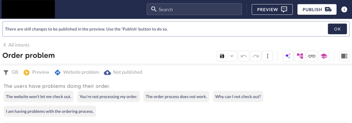
2. Intents view
In the Intents view, there is an overview of the chatbot's intents that have been created.
After clicking on an intent, detailed information on it, i.e. the title, the scenario, the status, the typical user enquiries and the relevance are displayed in the info box on the right.
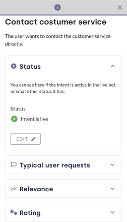
Click on the Edit button to open the content editor. You can find more detailed information on the content editor in the subsection 4 of this article.
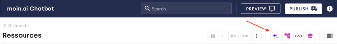
3. Companion to generate a response (coming soon)
The new feature automatically creates reply content. To use the function, click on the button with the three stars. This is located in the toolbar to the right of the topic title.
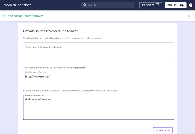
In the next step, a URL can be stored in the input mask. Based on the content of this website, generative artificial intelligence is used to create content and provide complete answers as a draft.
Optionally, further information can be added that should be taken into account when creating the answer
Click on continue to generate three different suggestions based on the information provided. As soon as the generation is complete, one of the suggestions can be selected.
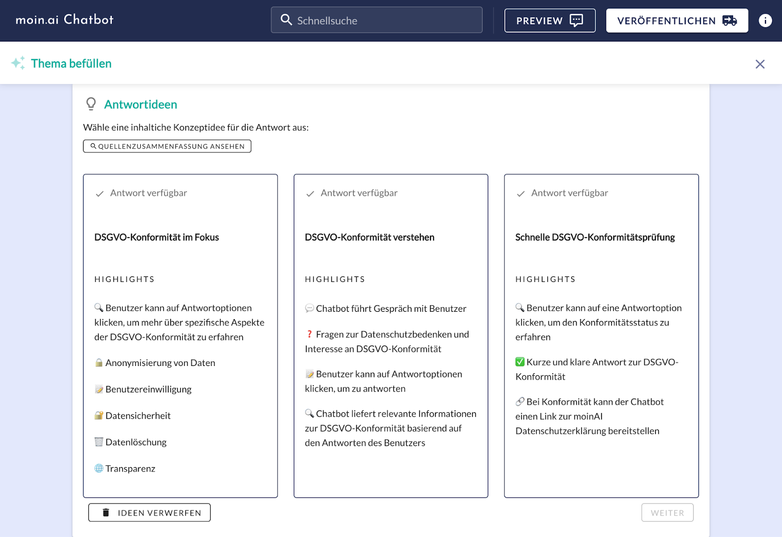
Please consider, that the the response-concepts provided where generated on the basis of a german-speaking website. The responses will be created in the language of the source provided.
4. Edit chatbot answers
The content-editor itself displays the title of the intent, the scenario and the typical user queries. Quick infos regarding the intent are also displayed above the scenario. The new control bar/toolbar is right next to the title. The sidebar can be opened on the far right.
a) Quick infos
Overall there are eight quick-infos. The following explains the meaning of each symbol:
 The intent is set on live.
 The intent is accessible.
 The intent is deactivated.
 The intent is redirected to another intent, which title is displayed.
 The changes are published.
 The changes are not yet published.
 Local changes are drafted, but not safed.
 The title of the channel in which the editor is opened is displayed.
b) save and discard/undo-redo-button
The button for saving or discarding local changes is located in the centre of the toolbar. As soon as an element of the response has been adjusted, the button turns green. The button is clicked and you can select whether the changes should be saved or discarded.
If a change is saved, it is advisable to make a note of what has been changed. This is done in the input mask after saving. This note appears in the overview (see 6. Change log) and you can see what has actually been changed.
The Undo/Redo button is located to the right of the Save button. A change that has been made can be cancelled or restored. As soon as the current draft has been saved, the undo/redo button can no longer be used. However, the previous status of the response can be restored (see 6. Change log).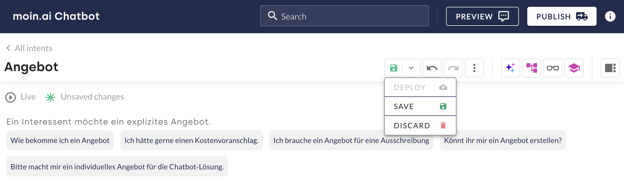
c) Copy and Paste content
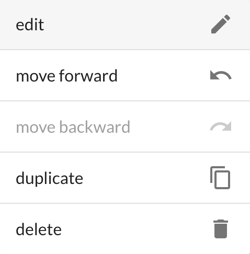
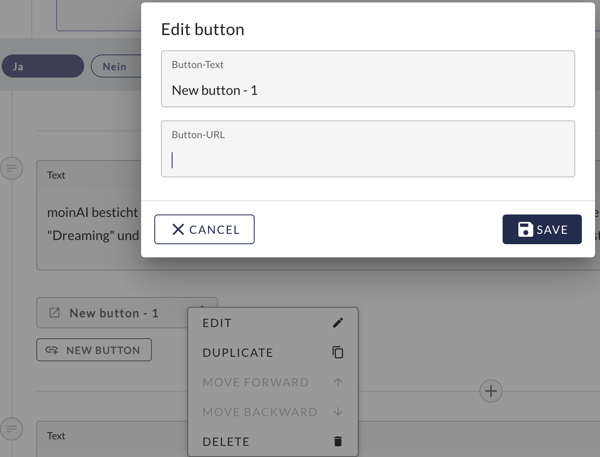
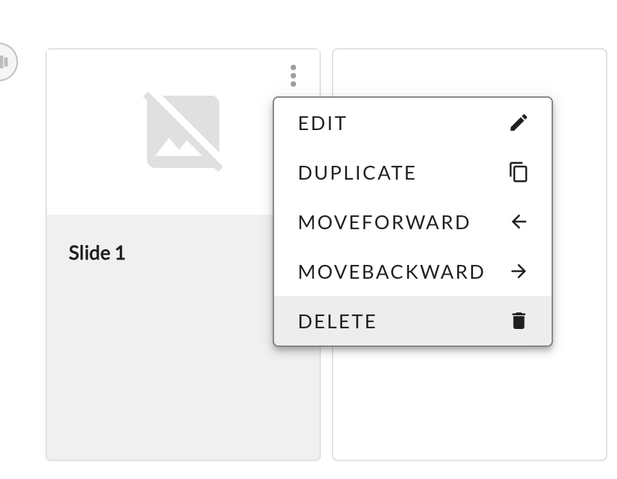
A control mask can be opened using the three dots to the left of the text field or graphic. Various commands can be executed here. Text content, images and slides can be copied and pasted elsewhere. The individual items can also be moved.
Similarly, individual answer buttons of a multiple choice question can also be moved. This also applies to links. However, copying is not possible here.
d) Structure of a chatbot response
The first step is the Query if uncertain. It is not always played out, but only if the AI is unsure whether the intended topic is actually meant. This is followed by the content of the topic, the bot's answer and the defined conclusion. The feedback question is set up by default.
An introductory sentence should be used as the first piece of information for users in order to pick them up thematically. This first information should be formulated in such a way that it provides a suitable introduction even without the preceding question in case of uncertainty.
e) Conversational design elements
The answer can then be saved and expanded with various conversational design elements.
A click on the plus opens the selection for the individual elements.

Elements can be removed on the left-hand side via the additional menu or the three-dot menu by moving the mouse pointer over them or their position can be moved further up or down within the response history.
Text fields
This element can be used to store simple text messages. A text field is always stored by default. Additional text fields can be added by clicking on the plus sign.
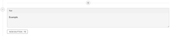
Each text field can be extended by up to three URL buttons.
Links
The link button can be used to store the URL to a website and the button text can be labelled accordingly. If required, it is possible to add further links using the plus button (up to a maximum of 3 buttons per text)
E-mails and telephone numbers can also be linked. To do this, click on the New button and then open the input mask using the three dots. The URL can then be entered.
Media/Pictures/Photos
In addition to texts and links, you can upload your own images under Media.
An image is either selected by clicking on Upload file or dragged and dropped directly into the field.
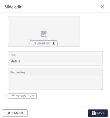
Slider and Videos
Slides allows you to upload several images in a kind of image carousel. In contrast to the previous option, a title, a description and a link can be added to each image.
The use of web-optimised images is recommended. This means that the image file should be as small as possible to keep loading times short. Furthermore, graphics should be used in landscape format. Images where the width is greater than the height are optimally displayed in the widget.
e.g. image with 955 x 500 px in 1:1.91 format as .png or .jpg (<150kb)
Videos can be added in MPG or MOV format in the same way. Each video can be up to 100mb, but here too, care should be taken to keep the file size as small as possible to ensure short loading times.
Yes/No Question
The yes/no question can be used in the same way as the multiple-choice question - but only has the two options yes and no as answer choices.
If users answer the question with free text, e.g. "Yes, please", this will be understood.
Multiple Choice Question
The option to expand the chatbot answer is provided by the next step. The options of the available Conversational Design elements can be viewed by clicking on the field.
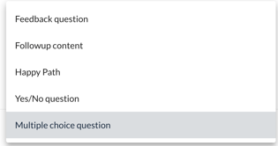
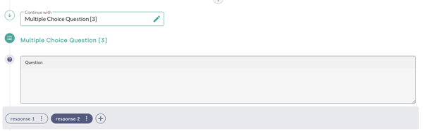
A multiple-choice question can be stored. The quick-reply buttons (here App and Website) each have their own partial answer. These are buttons that disappear again after the user has clicked them. Another button can be added with the plus sign.
Example: Users ask how they can reset their password. As there are several possibilities, they must be asked in advance where they would like to reset their password.
The follow-up multiple choice question reads: "Where would you like to reset your password?
Quick Reply Button Selection:
1. Response 1
2. Response 2
This is followed by an answer that can be selected from the options. The item is completed and a text message can be entered.
Follow-Up
The follow-up is a follow-up question with redirection to another existing topic or form, e.g. to the human takeover.
The follow-up always starts with a further question about the forwarding topic or form.
In our example, we assume that the users asked how they can log in to their account. Unfortunately, the answer did not help them and now they are offered to escalate their request to customer service via a follow-up and the form:takeover is played:
Follow-up question: "Would you like to escalate your concern to customer service now?"
By clicking on "Yes", the corresponding form is displayed and the user's request is forwarded.
Happy Path
The Happy Path element ends the topic with the Happy Path conversation element. Accordingly, there is no measurement of ratings or conversions and the topic ends with the statement that users are welcome to ask further questions.
If the conversion is set for goal tracking, the Happy Path is selected as the next action by default!
Feedback Question
The feedback question should be chosen as the end of an answer if it has an informative aim, to provide the user with information. The feedback (yes or no) can then be used to measure the quality of the answer.
In the statistics section, the ratings of the individual chatbot answers can be viewed.
5. Save draft
Finally, or ideally during editing, all changes made should be saved. To do this, select the previously described save icon in the toolbar (see 4b).
If a change has not been saved, the local draft of a user is always displayed. If several users are working on a topic, this local draft can be overwritten by another user if it has not been saved.
Suppose a colleague logs into the hub and adds a Quick Reply button to the reply and saves the customisation.
However, in edit mode, the personal local draft, there are still only the two Quick Reply buttons App and Website. If another change is made to the content, the personal draft must first be updated to the latest version by clicking on the Discard button. This is "activated" in such cases, i.e. it is not greyed out. As a result, locally saved changes are discarded and the current status of the response is displayed.
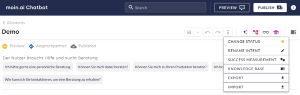
6. Extended context menu and sidebar
a) Extended context menu
The extended context menu is called up via the three dots in the toolbar. The title can be changed here. To do this, select Rename topic and enter the new title.
If the chatbot has several channels, you can switch between the channels here. A hub user remains in the selected channel until it is changed again, even when switching between topics.
The channel being used is displayed at the top of the quick info (see 4a).
Under the heading Measuring success, you can set whether success is to be measured on the basis of the conversion target or the evaluation question.
The visibility of an intent or the reply content is defined under change status.
🔴- The intent is deactivated. Both in the hub preview and in the live bot.
🟡- The intent is only active in the hub preview. It can be tested here.
🟢- The intent is active in the hub preview and in the live bot.
The Import and Export buttons can also be found in the context menu. Here you have the option of importing and exporting content in JSON format.
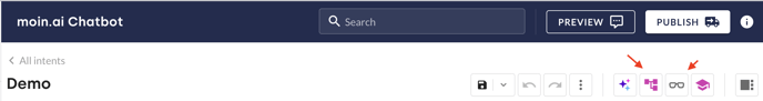
b) the sidebar
The sidebar is accessed via the icon on the far right.
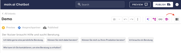
The options from left to right include the flow preview, the intent info, the change log and the companion (editorial assistent).
Flow Preview
The flow preview visualises the entire response structure. There is no possibility of customisation based on the individual modules. These can be used for orientation in addition to editing the response in the editor.
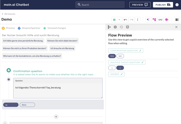
To make changes based on the graphical representation, the flow chart must be selected (see 7.).
Intent Details
The "i" is used to call up the general topic info or the topic details. It is therefore the topic overview (see 2.) in the reply editor - the same content can be viewed.
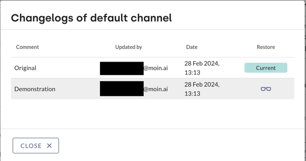
Change-log
The change log is called up via the time symbol. All previously saved versions of the response content can be viewed here. Each version has the change note in the title (see Save and discard, 4b.).
The currently published version can be viewed next to the change. Previous versions can be viewed by clicking on the spectacles symbol in the reading view (see 7.). The "Apply" option appears at the top, which transfers the open version to the content editor, where it overwrites the previous, most recent version. The content can then be customised, saved and published.
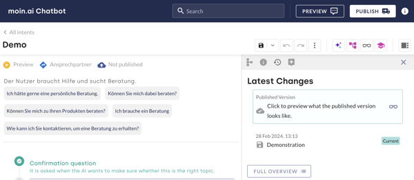
By clicking on complete overview, you can see which hub users created which version at which time (time and date). The read view can also be selected again here.
Companion as an editorial assistant
Click on the chat bubble with the star to open the companion. Information on the Companion can be found in this knowledgebase article.
7. Flowchart (coming soon) and reading mode
The large flow chart view is called up via the three-part diagram. The reading mode via the glasses symbol.
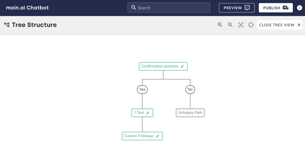
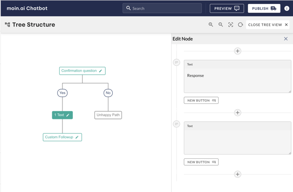
a) Flow Chart
The flow chart is the systematic representation of the answer. Unlike in the flow preview, a single step can be clicked here. The content editor then opens on the right-hand side and the answer can be customised as usual. The structured view remains open.
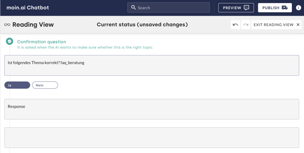
b) Reading mode
The current editing status is displayed in the read view. If several editing statuses have been saved, you can jump between the individual versions using the two arrows - as with the Undo-Redo button.
The current version is always labelled with the note (provided). The unsaved version is labelled with the note (unsaved).
6. Publish content
Before clicking the publish button in the top right-hand corner of the hub, all changes made should first be tested in the preview. Finally, click on Publish and the created content will be available for users in the live chatbot.
Good to know:
Changes made in edit mode must be saved manually before they can be published.
The publish button can only be clicked after changes have been made and is otherwise greyed out.
If changes to content are still unpublished, a notice will appear at the top of the Hub.
The recommended procedure is as follows:
- Enter or adapt the content and save it
- Click the Preview button
- Test changes made in the preview chatbot
- Everything perfect? Then just click the publish button and off you go! 🚀