"Widget Brightness" in the widget editor is a preset set of brightness values or grayscale levels that are already matched to each other. These values are not customizable in detail - this ensures that the widget always maintains a harmonious overall impression across different brightness levels. In practice, this means that the brightness options Neutral, Light and Dark apply to all colourless elements of the widget, from white to gray in various gradations to black.
To allow as much flexibility as possible when customizing the widget to your liking, we have developed different brightness settings:

The three brightness options
Neutral
- Background of the chat window is in light gray,
- bot messages on white background,
- neutral, overall effect tends to be bright.
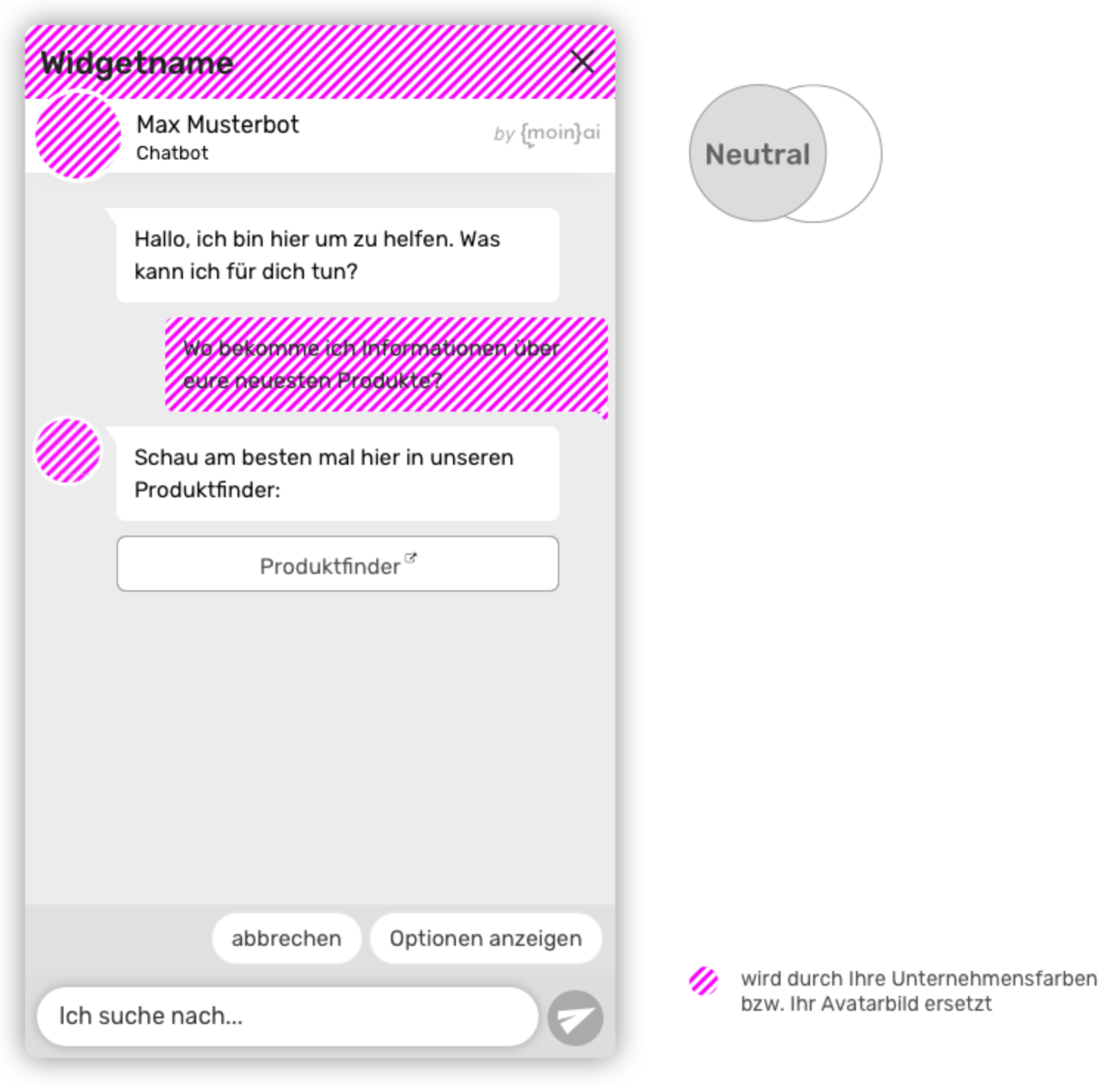
The Neutral brightness option is the best choice for the vast majority of websites. The elements of the widget are designed to be as neutral as possible and visually restrained. The focus is on the content as well as visually on the colours of your company that can be set in the widget editor.
Light
- White background of the chat window,
- Bot messages on light gray background,
- especially bright overall effect.
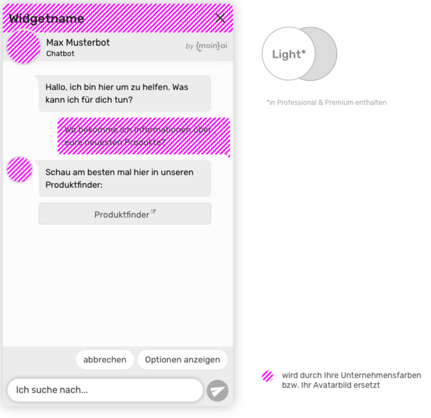
The Light option is similar to the Neutral setting, but the focus here is on creating an overall impression that is as bright as possible. Especially on very brightly designed websites with a lot of white space, this setting can prove to be suitable.
Dark
- Background of the chat window is dark gray,
- messages on medium gray background,
- very dark overall effect.
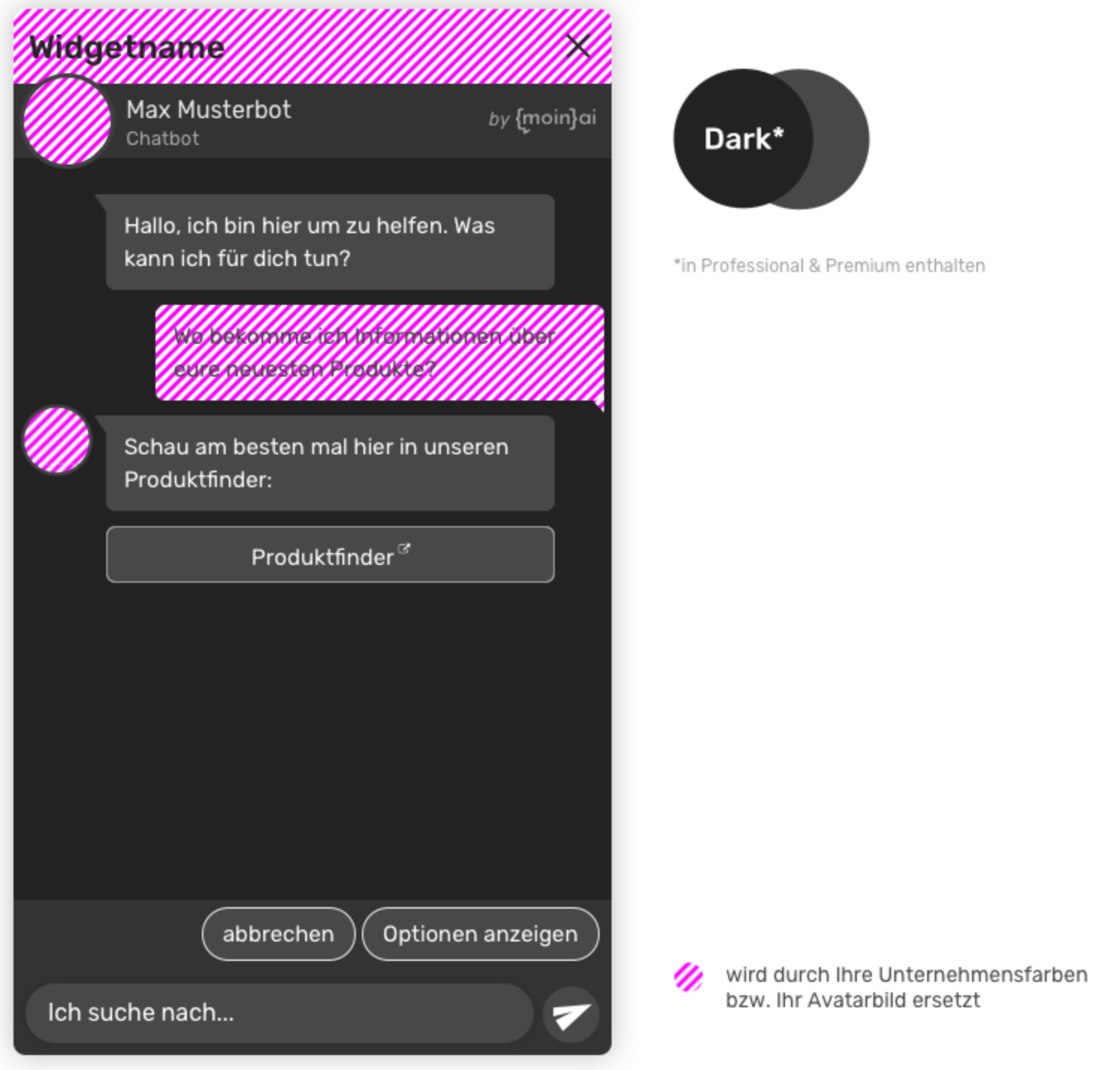
The Dark option is especially suitable for dark environments. Similar to how there is now a "Dark Mode" on many current smartphones and laptops, you can also "turn off the light" for your widget.
For more on choosing the appropriate brightness in conjunction with your chosen colours, see Appearance and Widget colours.