Everything about colours in your chat widget
You can customize the colour of the widget according to your specifications (e.g. to your corporate colours) and have the option to set the appropriate colour for each of the central elements in the widget as well as the respective contrast option in light or dark.
Base colour and secondary colour
First of all, you set two colours in the widget: a base colour and a secondary colour - you can choose them freely. They serve as a base for all further colour settings on the widget. If you make changes to these colours later, they will globally affect all elements equipped with these colours - so you can control the overall colour impression of the widget conveniently from one place.
Colourize & Contrast Option
After setting your base and secondary colour, you can set which of the colours should be used for each of the central elements of the widget.
For example, you can set the widget button and header to appear in the selected base colour, but the user text bubbles to appear in the selected secondary colour - or any other assignment you choose. For each of the adjustable elements, you can decide separately which of the colours to use.
In addition to the colour selection, for each of the adjustable elements you have the option to select a light and dark variant, depending on which option suits better. For example, if you have chosen a very light colour for the widget button, the icon with the speech bubble in the widget button may not be easily visible if it is coloured white. For this reason, we have provided both a light and a dark variant for each adjustable element in the widget editor. You can decide separately for each element which contrast option fits best.
For an overview of all elements that can be coloured, see Appearance.
Examples / Do's & Don'ts
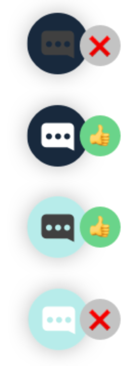
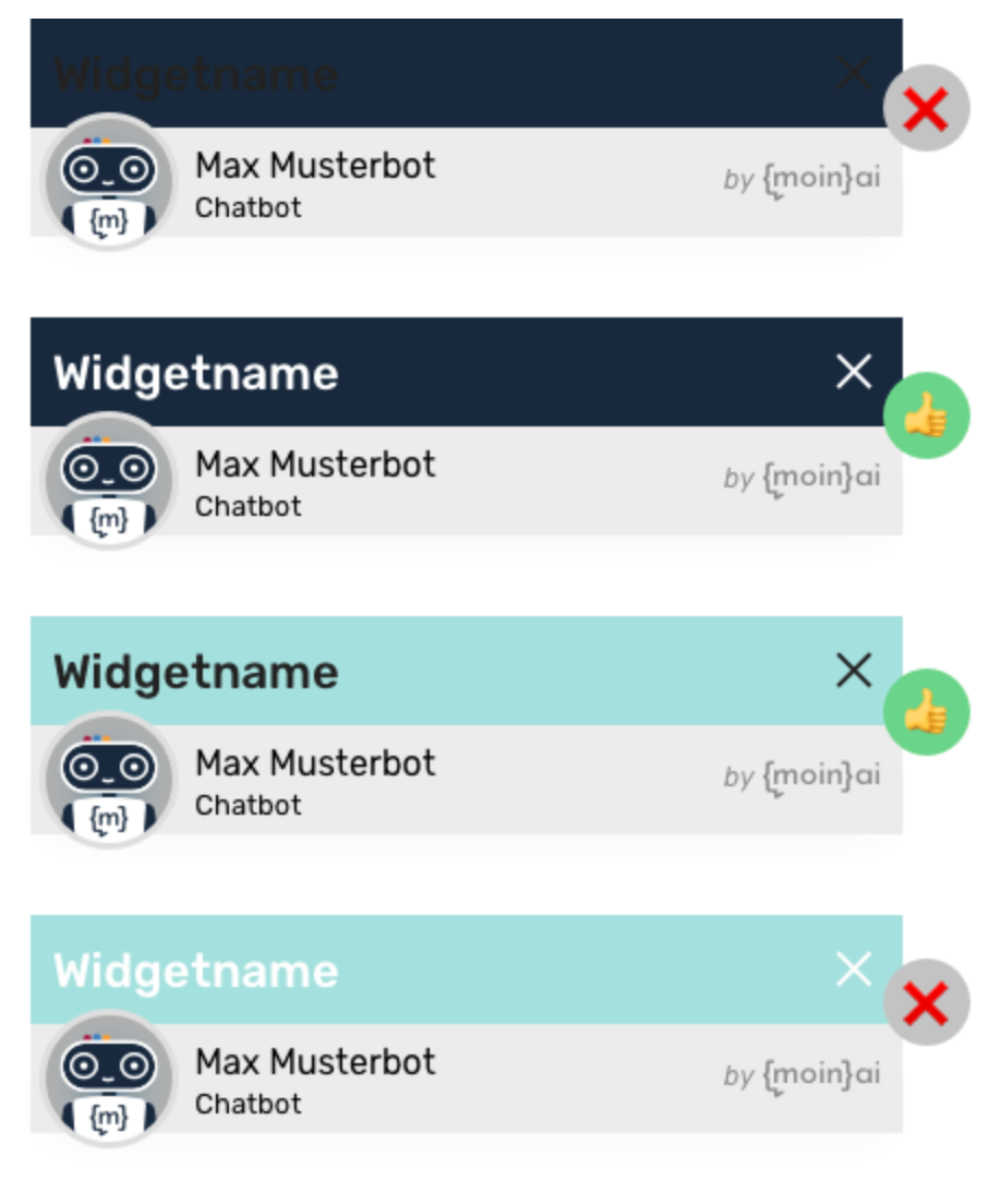
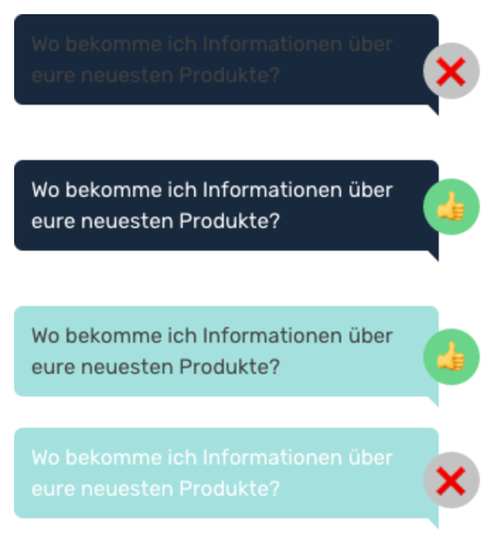
In the following examples, the base colour is deliberately chosen to be particularly dark and the secondary colour particularly light to illustrate the different variations for each element.
Widget button
In the following example, the contrast chosen is to weak: the speech bubble in the widget button is not well visible. Here it is better, to choose the second or the third variant.
Widget header
In the following example, the first and the last variant are also contrasted too weak: Especially in the first variant, the text is almost not recognizable at all. Variant two or three should be chosen here.
Speech bubbles (user)
Similar to the header, the text is almost not visible in the first variant. The contrast is also too weak in the fourth variant. Variant two and three are well recognizable.
For more on using colours in conjunction with the appropriate brightness, see Appearance and widget brightness.