Overview of the central customisation options of the widget - avatar, colours and brightness
Visual representation of the widget
You have the possibility to influence the presentation of the widget in central points and, for example, to adapt it to your corporate design. This includes the selection and design of a suitable avatar, the colouring of central elements and the selection of the appropriate brightness option for the widget as a whole.
The two colours chosen in this article (shades of blue) are only examples. You can freely choose which colours are used in your case in the widget editor.
The Avatar
The avatar is the "face" of your chatbot. It represents either a fictional conversation partner, such as Moini, the avatar of moin.ai, or any other character of your choice. The avatar appears in several places in the widget, such as in the header or in the chat history next to a new chatbot message, and serves as a virtual counterpart for users.
You have the option of choosing an avatar in the "Moini design" and adapting it to your corporate colours and - if desired - you also may add your logo. Alternatively, you can use your own avatar. If there is nothing in your corporate design to prevent this, we recommend using the avatar in the "Moini design", as it is already optimally set up for use with the widget.
You can find out more about using the avatar under Avatar.
Widget colours
The widget colours are used to visually adapt the widget to the colours of your corporate design, for example. To do this, you have the option of setting a basic colour and a secondary colour at a central point in the widget editor. You can then assign these colours separately for all central elements of the widget. In the widget editor you can also see in a preview how your chosen colours work with the individual elements of the widget and, if necessary, choose between a light or dark contrast option for each element - depending on which option suits the chosen colour better.
Combine your colours with the appropriate contrast option
Which elements can be coloured?
The central elements that you can colour are the header bar, the speech bubbles on the user side and the widget button when the widget is closed. You can decide separately for each of the elements whether you prefer to use the base colour or the secondary colour. You can also choose the appropriate contrast option (light or dark) for each element.
More about the use of colours under Widget colours
Widget brightness
In addition to the widget colours, you can globally set an overall brightness for the widget: In the Essential plan, the option "Neutral" is available. In the Professional and Premium plans, you also have the choice between "Light" and "Dark".
More on this under Widget Brightness
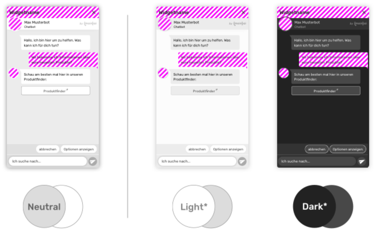
Combining colours & brightness correctly: Examples
The following three examples show, how you can combine the basic and secondary colours for each element, including the appropriate contrast option, with the global widget brightness.
The global widget brightness is set to "Neutral" in this example. The rather dark basic colour of the header in combination with the rather light secondary colour, as background of the speech bubbles, forms a balanced overall picture.
The global widget brightness is set to "Light" here. In this example, the rather dark basic colour is chosen for both the header bar and the speech bubbles, although other combinations are also conceivable.
The global widget brightness is set to "Dark" in this example. Here, the rather light secondary colour has been used both in the header bar and for the speech bubbles, as it creates a pleasant counterpoint to the dark overall impression of the widget.
Learn in detail how to customise the different components of the widget
More about using an avatar.
More about using the widget colours.
More about the widget brightness settings.